Camouflage Journaling
When it comes to digital scrapbooking, capturing and preserving our stories is the biggest part of why we do this. We try to ensure that the journaling in our layouts is legible and easily readable — that’s the whole point, right?
But, sometimes letting all of our journaling show may not be the best idea. Confused? Read on to see why.
Note: The image above is actually a layout featured in a Vicki Robinson tutorial on adding hidden journaling to your digital page.
Highlight Or Camouflage Journaling
You might be confused by the header for this section. Highlight and camouflage seem to be somewhat contradictory terms. In essence, the technique I’m about to share really accomplishes the same thing. And it works best on newsprint type backgrounds. But that doesn’t mean you can’t try it on other busy backgrounds.
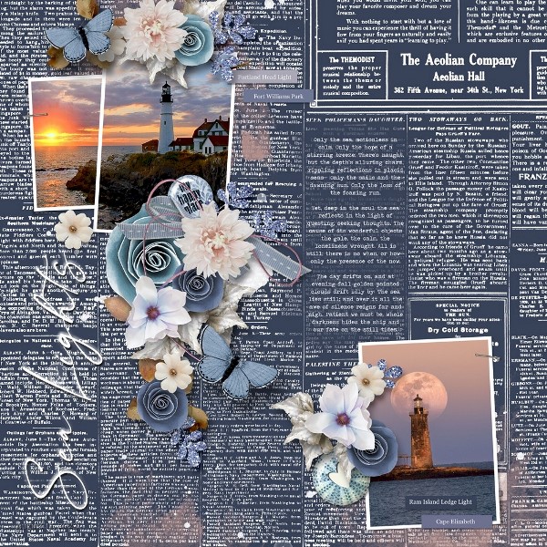
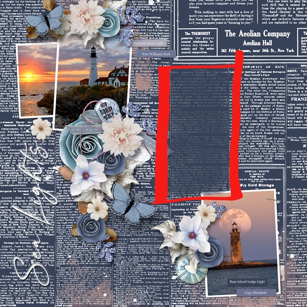
Note: The above layout is one I recently created using products from “Seashell Memories” by Heartstrings Scrap Art. For more details about this layout, you can find it in my 2023 Personal Gallery.
So, if you’ve been following me for a while, you may have already seen my tip about using a mask (or paint) to help journaling stand out on a “busy” background without totally hiding the background. Conversely camouflage by definition means to disguise or “mask” something so it’s not quite so easily seen and tends to “fade” into the background. Think military or hunting camouflage. You can still see the person but they blend into the environment. Whether highlighting or camouflaging, a mask will be involved.
I sometimes use dark and busy backgrounds, as you can see in the image above. While newsprint type backgrounds aren’t as busy as some (at least not in most cases), it can still make journaling a bit of a challenge. But it also makes this technique so fun.
In the case of this particular layout, I did want the text of my journaling to be easily readable. But at the same time, I also wanted it to kind of blend in with the newsprint so it didn’t take over the whole page.
All I had to do was add a mask directly above the background paper and recolor it to match the main color of the background. Then I added my journaling in a color that contrasts with the mask but also compliments the color of the newsprint. I LOVE how the journaling blends in, but doesn’t blend in, if you know what I mean!
The easiest way I’ve found to create the camouflaged journaling is to first find a section of the newsprint where the journaling will fit nicely. Such as right here:
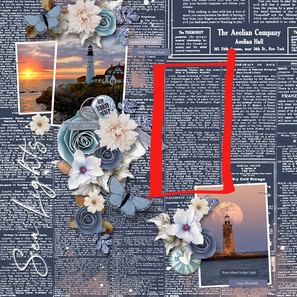
I then type my journaling in a color that is in high contrast (bright yellow, fuchsia, green, etc.) to the background color.

With the text formatted just the way I want it I create a new (blank) layer below the text. Then I just grab one of my favorite brushes (I prefer to use a watercolor brush) and start painting the mask behind where the journaling is located. Note: I hid the text layer so you could see only the mask.
Then I change the color of the journaling to blend well with the newsprint:
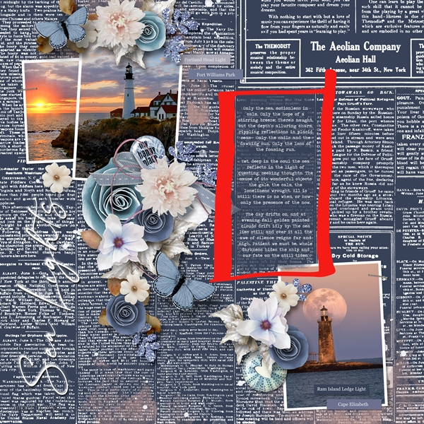
The real trick to this is selecting a font that is complimentary to the newsprint but different enough that it’s still legible. You also want the color of your text to be similar but not so much that it doesn’t stand out some.
If you find that your mask isn’t letting quite enough of the original paper show through just adjust the opacity until you’re happy with the result.
And there you have it…journaling that is camouflaged (and highlighted) but still very legible.
Hide Journaling
I don’t know about you but sometimes my story is deeply personal. Even so, I still want that text to be legible (but perhaps not readily) when the page is printed. The opposite may be true if I post a page to an online gallery or other social media forum. That presents a bit of a dilemma because if I leave the journaling off the page, I’ve lost a key element of the page design, right?
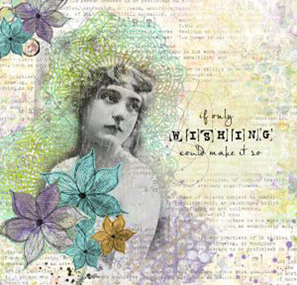
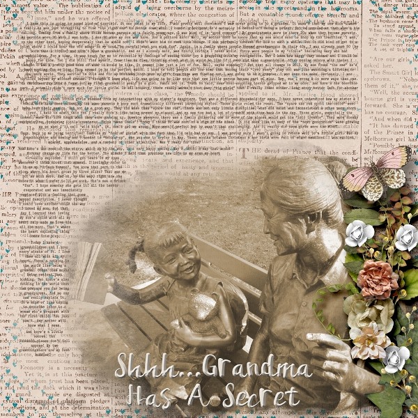
Note: The above layout is one I recently created using products from “Time Flies” by Heartstrings Scrap Art. For more details about this layout, you can find it in my 2023 Personal Gallery.
In these instances, I do pretty much the same as I did above with the lighthouse layout. Only this time the mask is much less opaque, allowing more of the original newsprint to show through. And the text is in a color & style that more closely resembles that of the newsprint.
At first glance you might not even realize there was any journaling. And I wouldn’t have a single problem posting this very personal layout on an online forum (or my blog gallery) as the journaling is all but impossible to read at the “posting” size.
When it is full-size and printed, the journaling is legible but not easily. Which is exactly what I wanted to achieve. My story is there, but not so much that just anyone would take the time to try reading it.
The trick here is to keep the mask fairly transparent and select a font that very closely resembles that in the background. I did play around with different bevel styles and shadows to get it to the point where it wasn’t completely hidden. So do experiment with those options if you try this out.
There are other tips & techniques out there for how to “hide” your journaling. If you’d like to explore some of those options just search the internet for “hidden journaling”. Vicki Robinson has a great tutorial on her website. I’d encourage you to check that out.
I will add another little note here, for the purposes of passing this story down to future generations I will print the journaling on a sheet of paper, place it in an envelope and attach it to the backside of my printed layout. That way it’s not totally lost!
Some Important Tips For Camouflaging Text

Don’t be afraid to include very personal stories on your layouts. Just be careful how easy you make it for others to read. Make it nearly impossible to read unless they take a “much closer look”.
Don’t hesitate to put journaling on busy paper. Harness the power of masking just enough to keep the background somewhat visible but still tell your story.
When using this technique on newsprint type backgrounds play around some with the justification of the text. I have found that sometimes using a center justification will help with the “blending”. If you left or right-justify your text it can give a noticeable hard “line” on the edge of the text that might make it stand out more from the background.
Don’t forget that you can adjust the opacity of your mask to control how much or how little of your background paper will show through.
As usual, if you have any questions or need a bit of help, please don’t hesitate to “Message Me” for some assistance.
Thanks for reading this week’s Tuesday Tip. If you want to stay informed about next week’s post, just click “Follow Me” to get an update. I hope you have a wonderful week!